

Portfolio of Suvo Ray
Design, Art, Type and everything in between

In 2019, we started this project to improve the visual design of Teams. There were several reasons for this.
Firstly, the previous interface did not focus on the main canvas; instead, more attention was drawn to the left rail.
Secondly, Teams' performance in terms of speed was not satisfactory. As a design team, we might not have had much control over the engineering system, but we wanted to help users perceive Teams as a lightweight and user-friendly product.
Thirdly, Teams 1 was originally based on Angular, but engineers later decided to move to React, and we used this opportunity to update Teams' visuals.
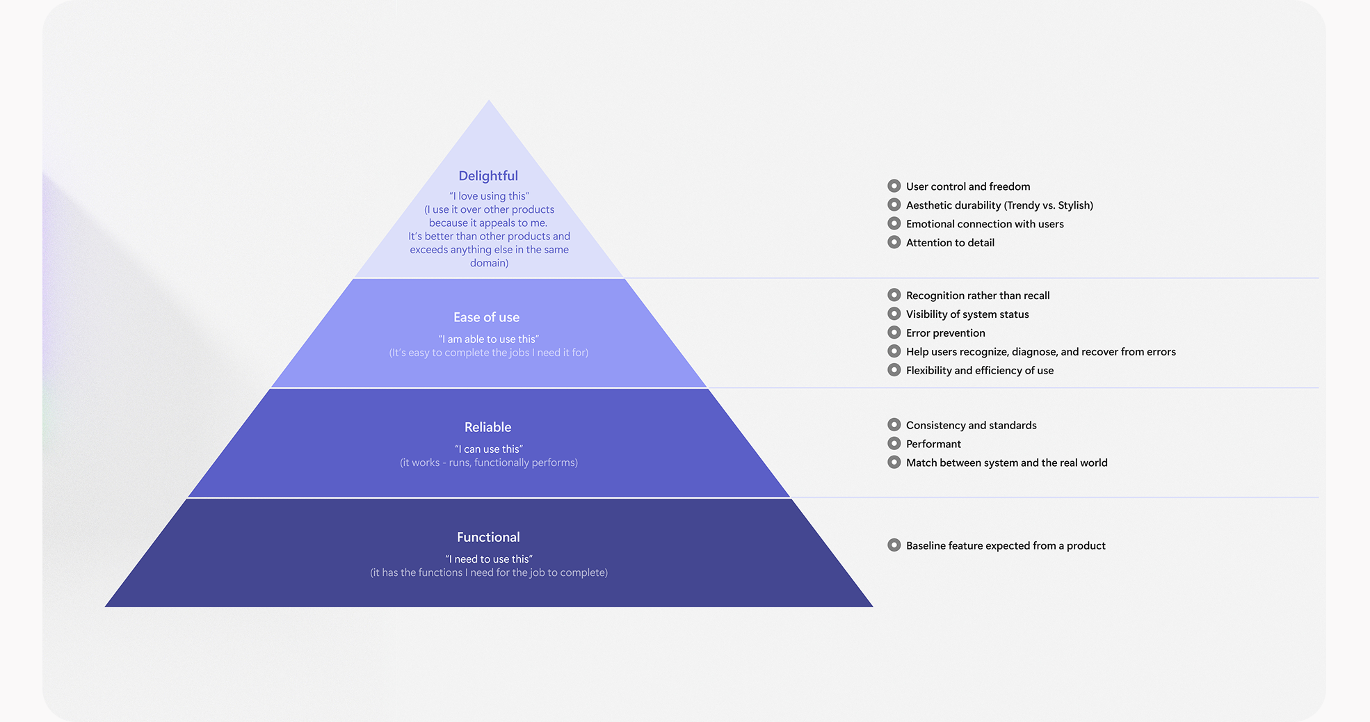
If we look at any product, we know there are several ways people perceive it. However, if we try to categorise them, we will see there are mainly four ways people perceive a product:
1. Functional
2. Reliable
3. Easy to use
4. Delightful
We wanted to evolve the Teams design so that customers perceive it as lightweight and easy to use. To achieve this, we needed to understand the problems with the current UI.
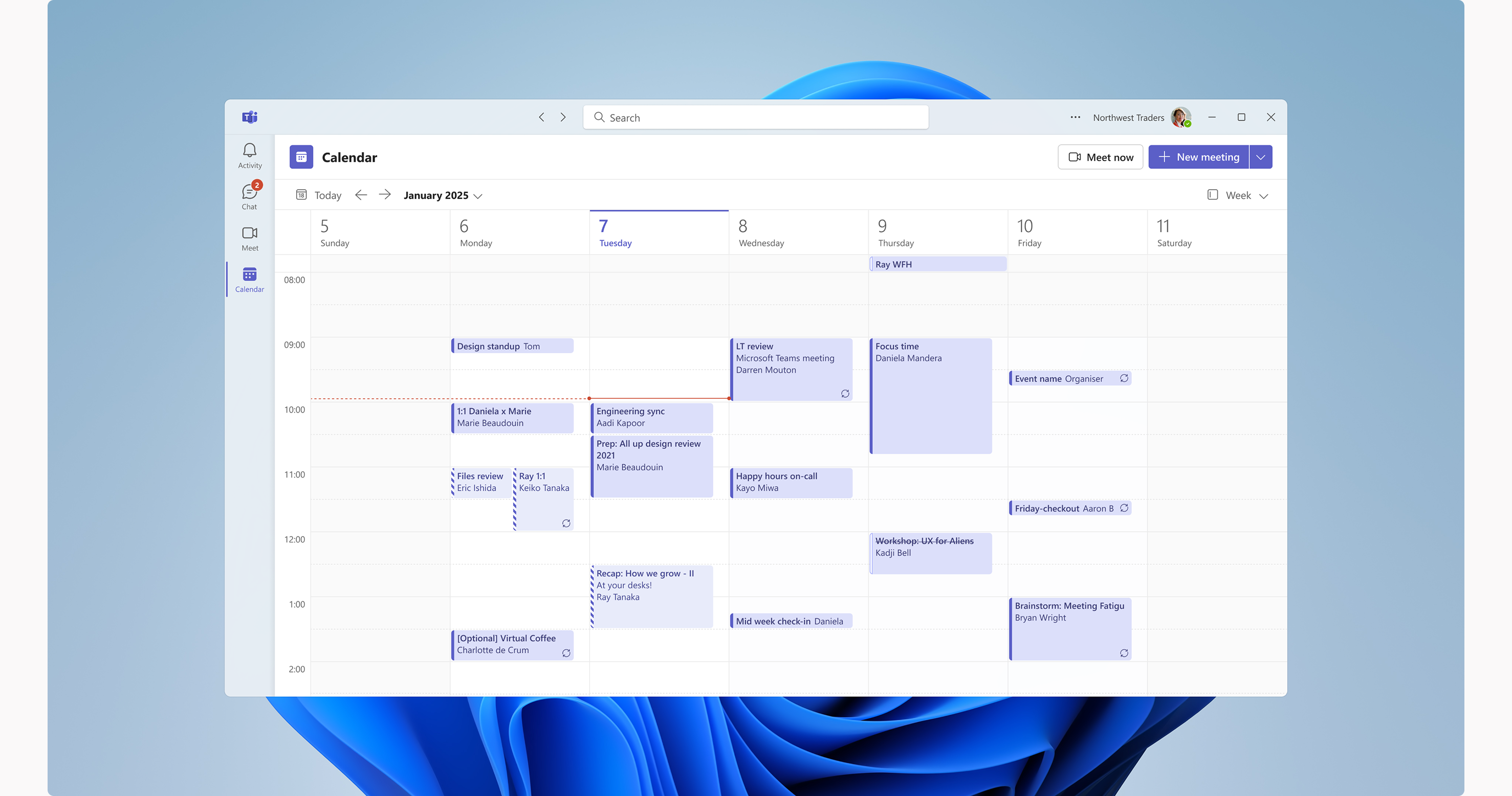
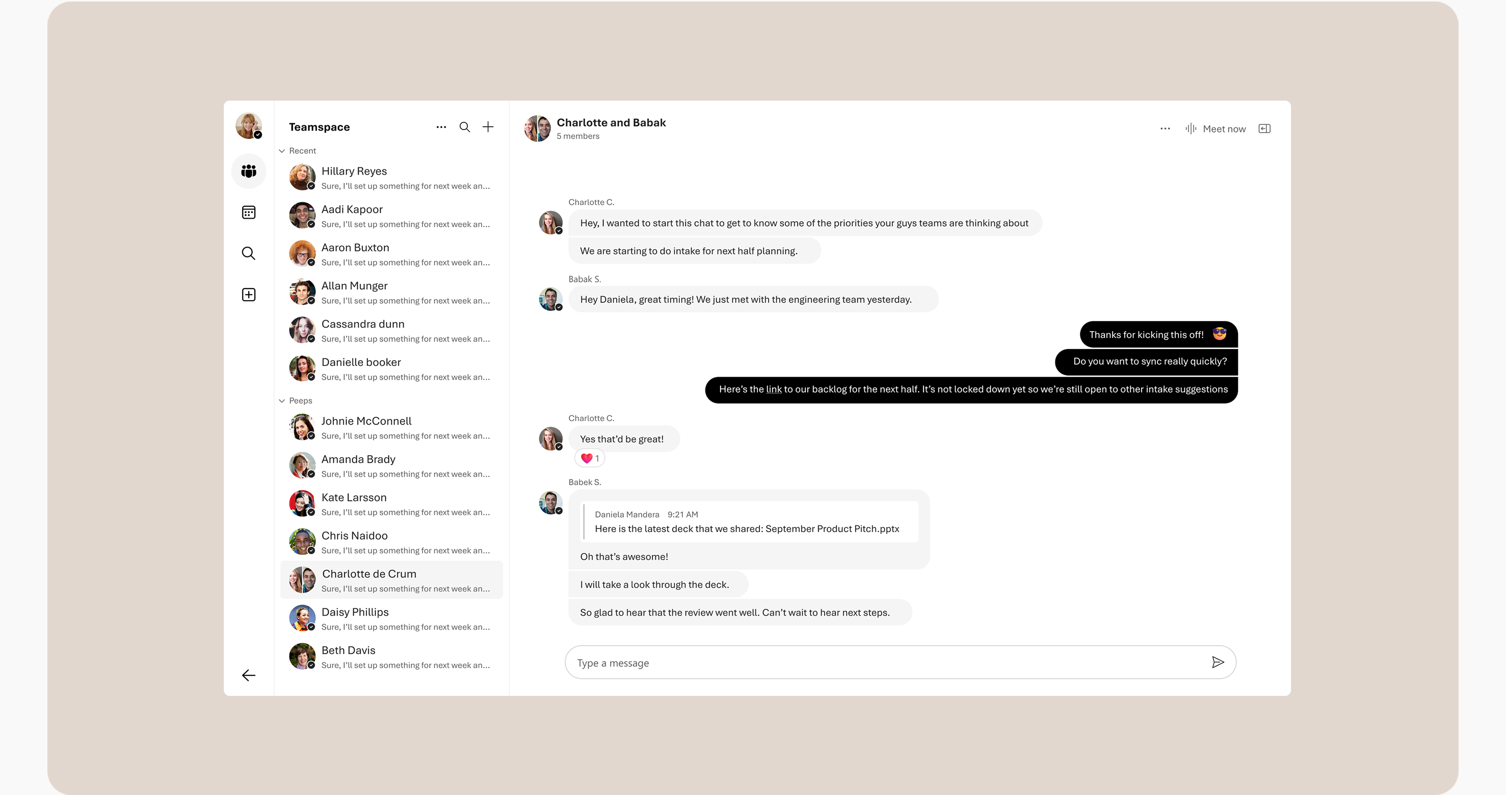
In the current UI, most of the focus is drawn to the left rail, even though customers actually spend more time on the main canvas. Additionally, the app bar and header are too loud, almost constantly demanding attention.
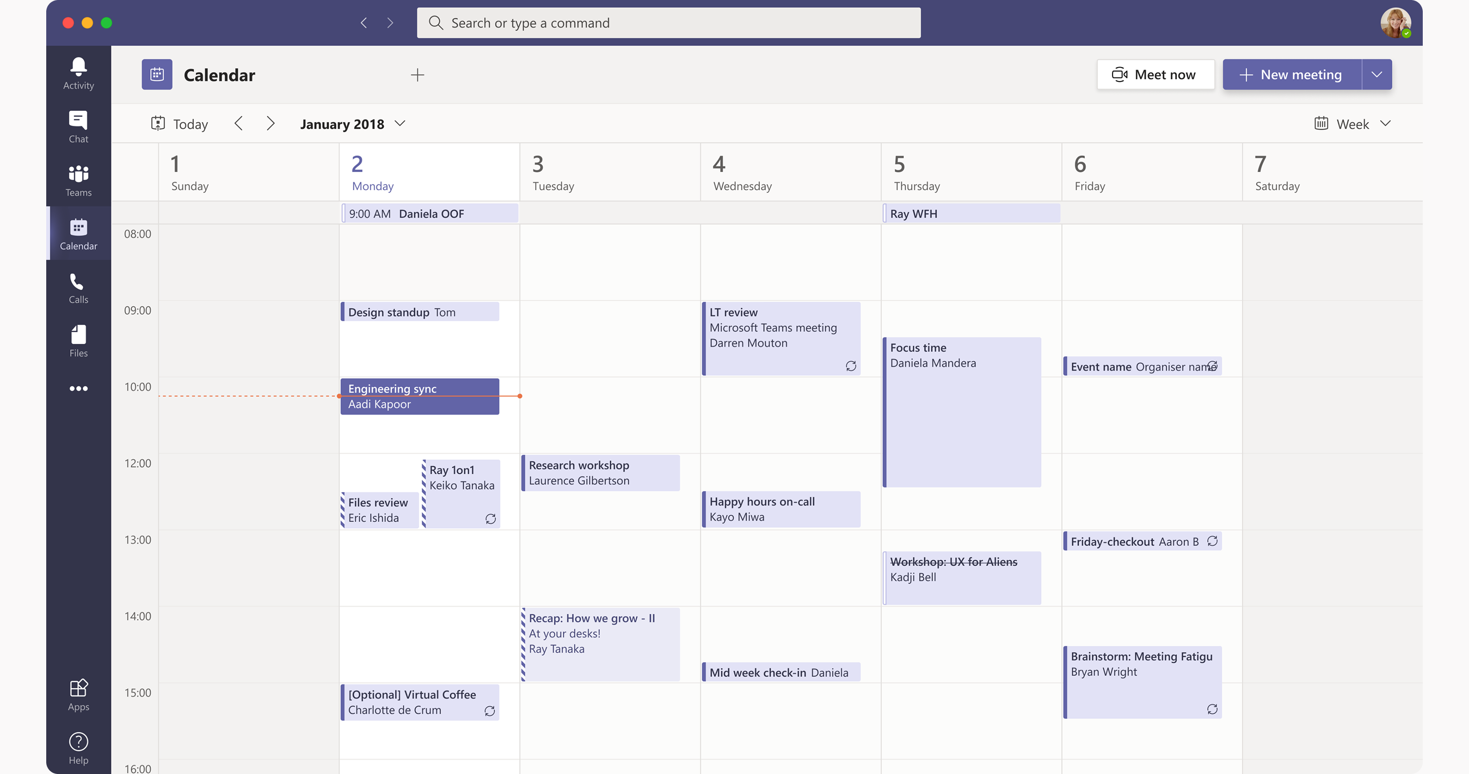
We aimed to evolve the Teams design so that customers perceive it as lightweight and easy to use. To achieve this, we needed to understand the problems with the current UI. Currently, most of the focus is drawn to the left rail, even though customers spend more time on the main canvas. The app bar and header are too loud, almost constantly demanding attention.
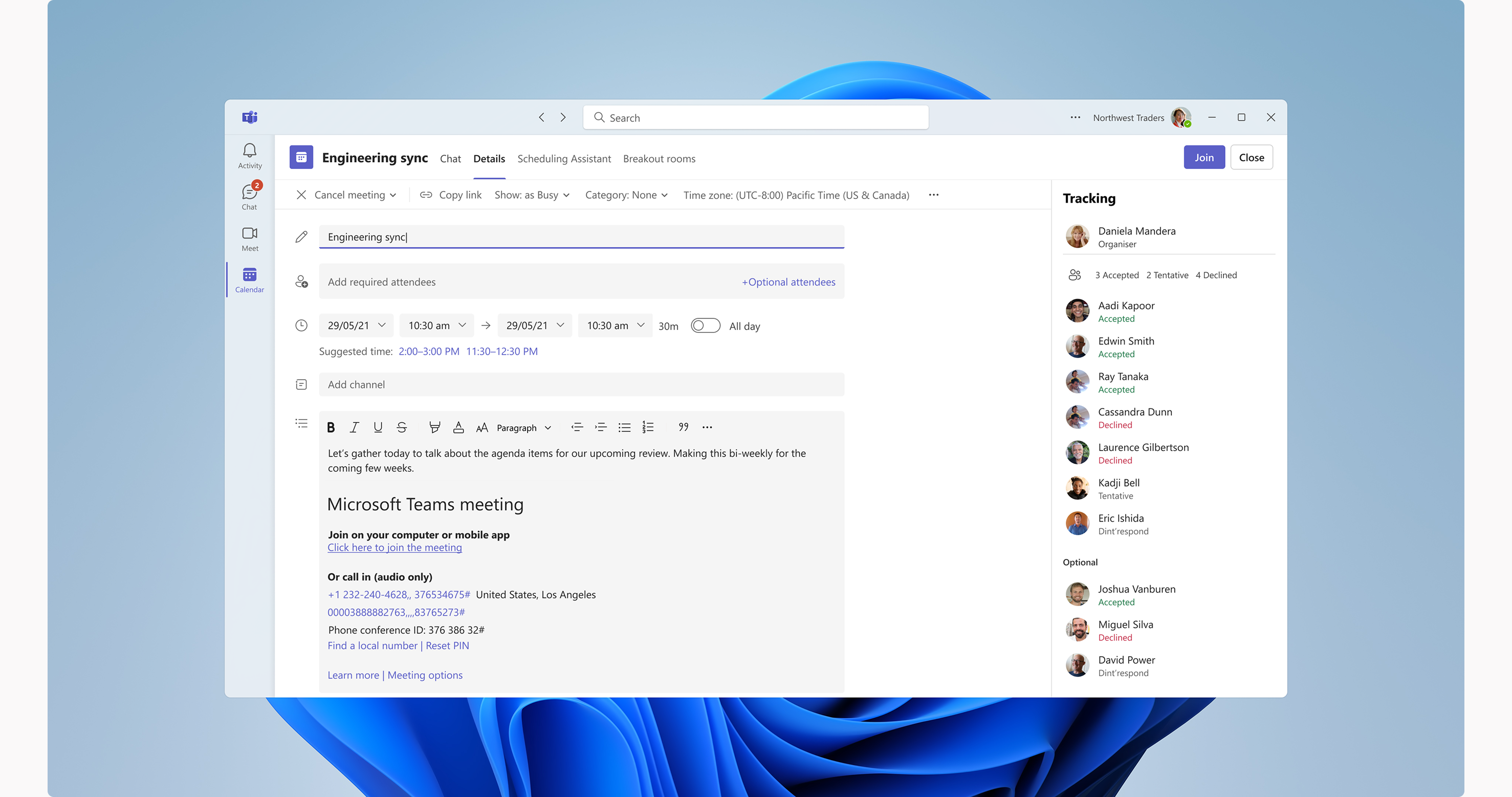
We wanted to move towards a more neutral canvas design, which should help people focus more on content.
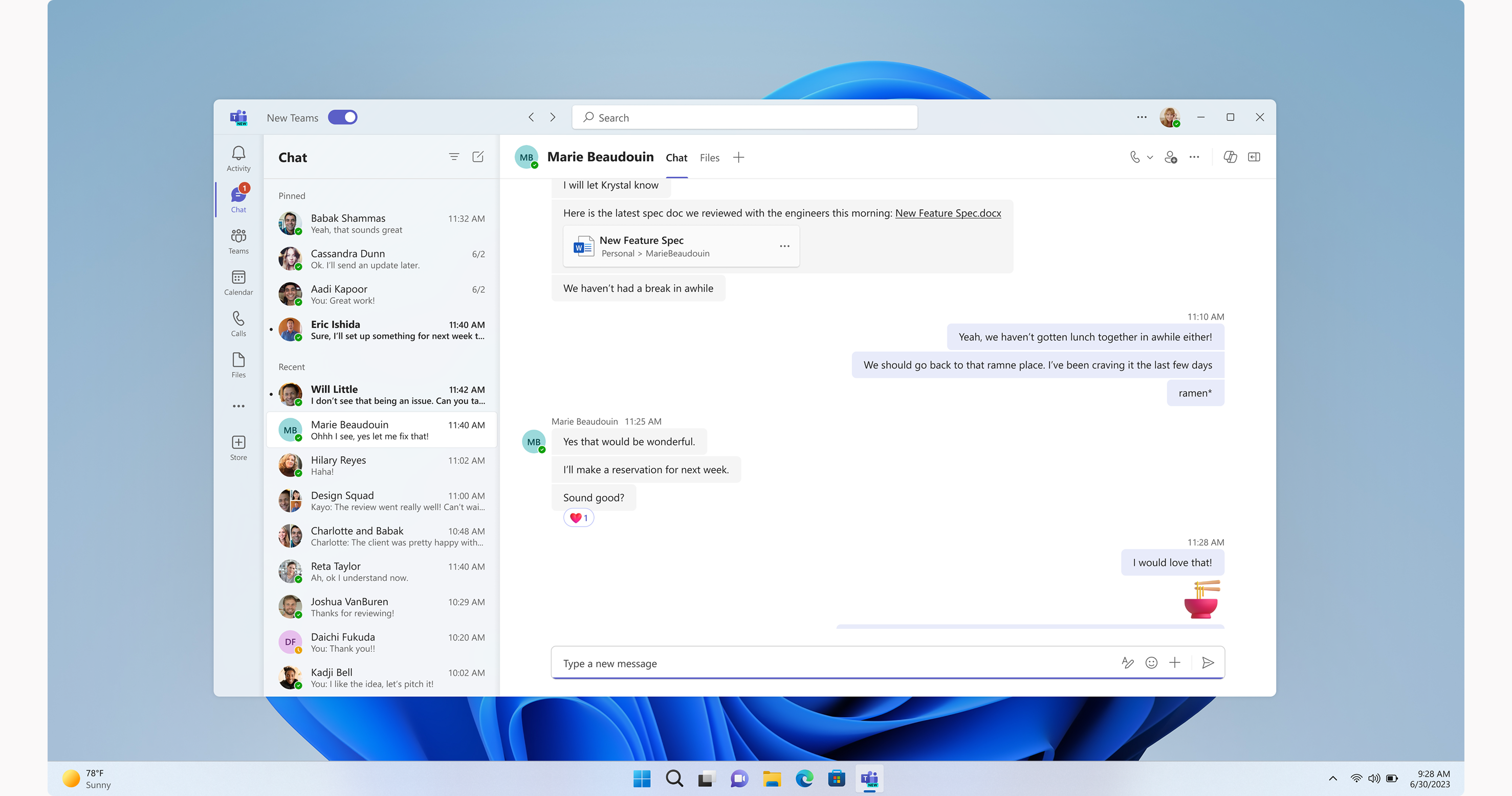
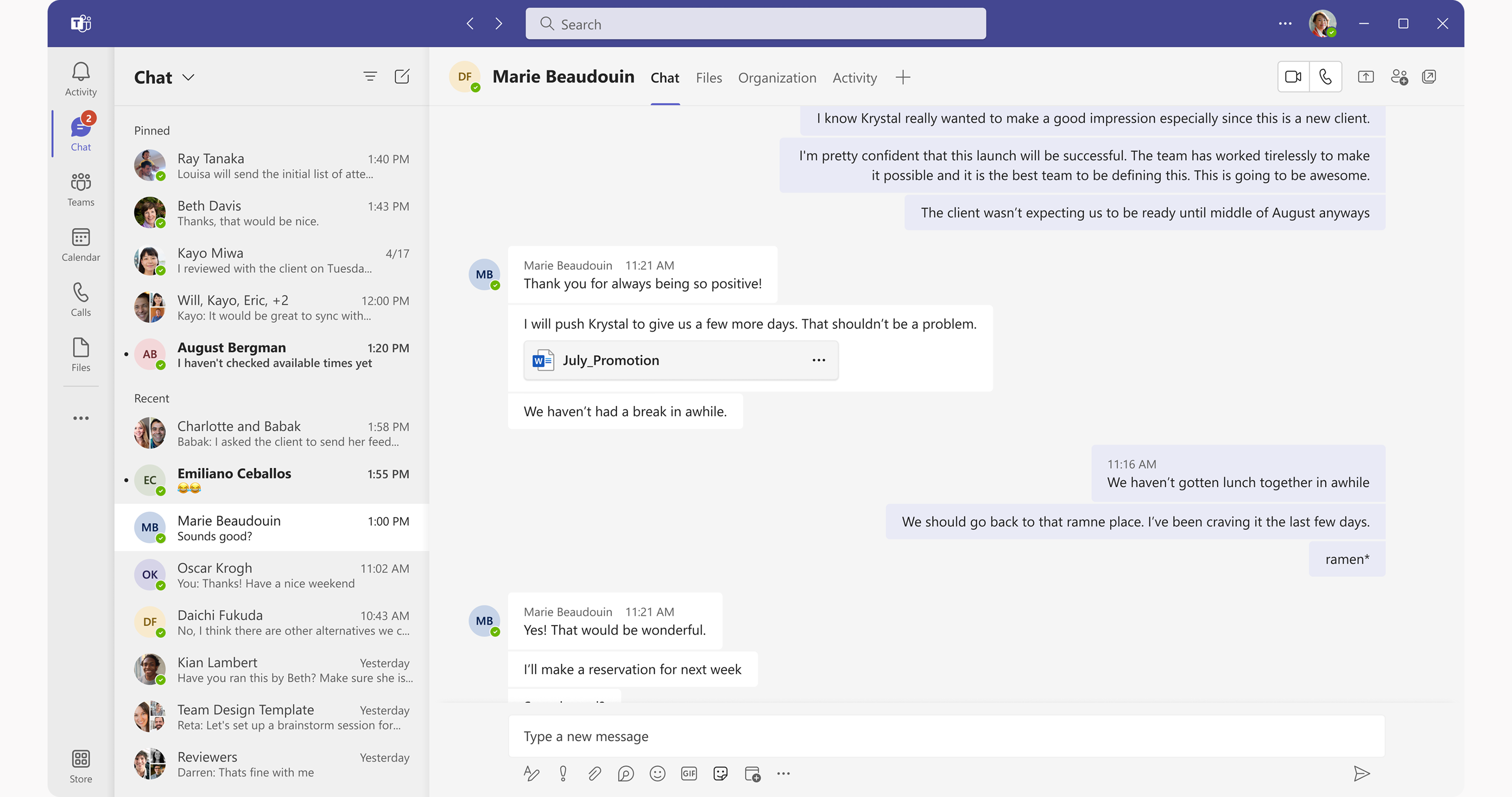
When we showed the design, customers mentioned that it felt lightweight and refreshing. However, some customers also said they missed the purple Teams theme.
To address this feedback, we decided to implement changes in stages. First, we updated the canvas, left rail, and app bar.
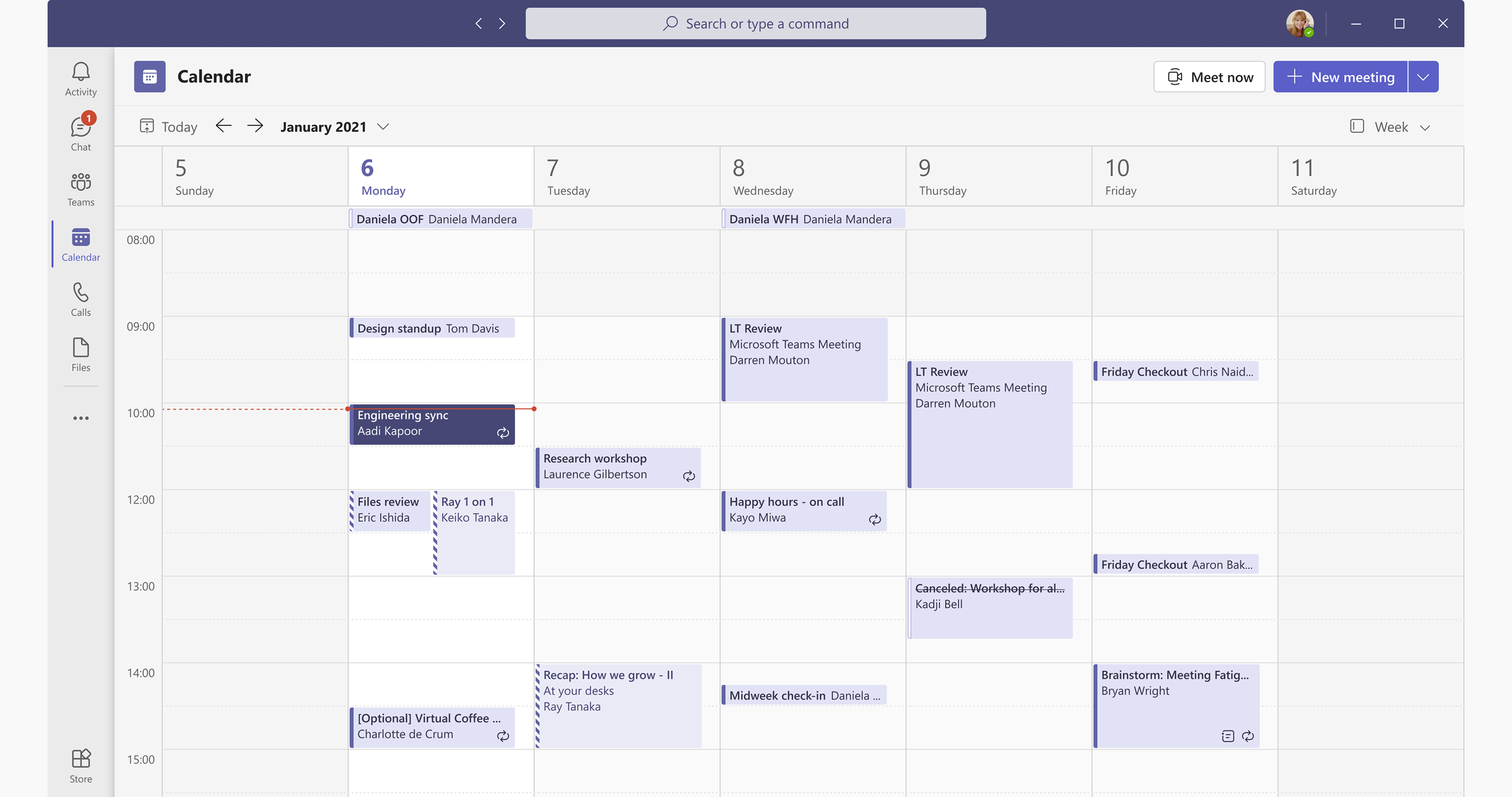
After a year, we moved into the final stage and achieved our original goal: transitioning to a fully neutral canvas.
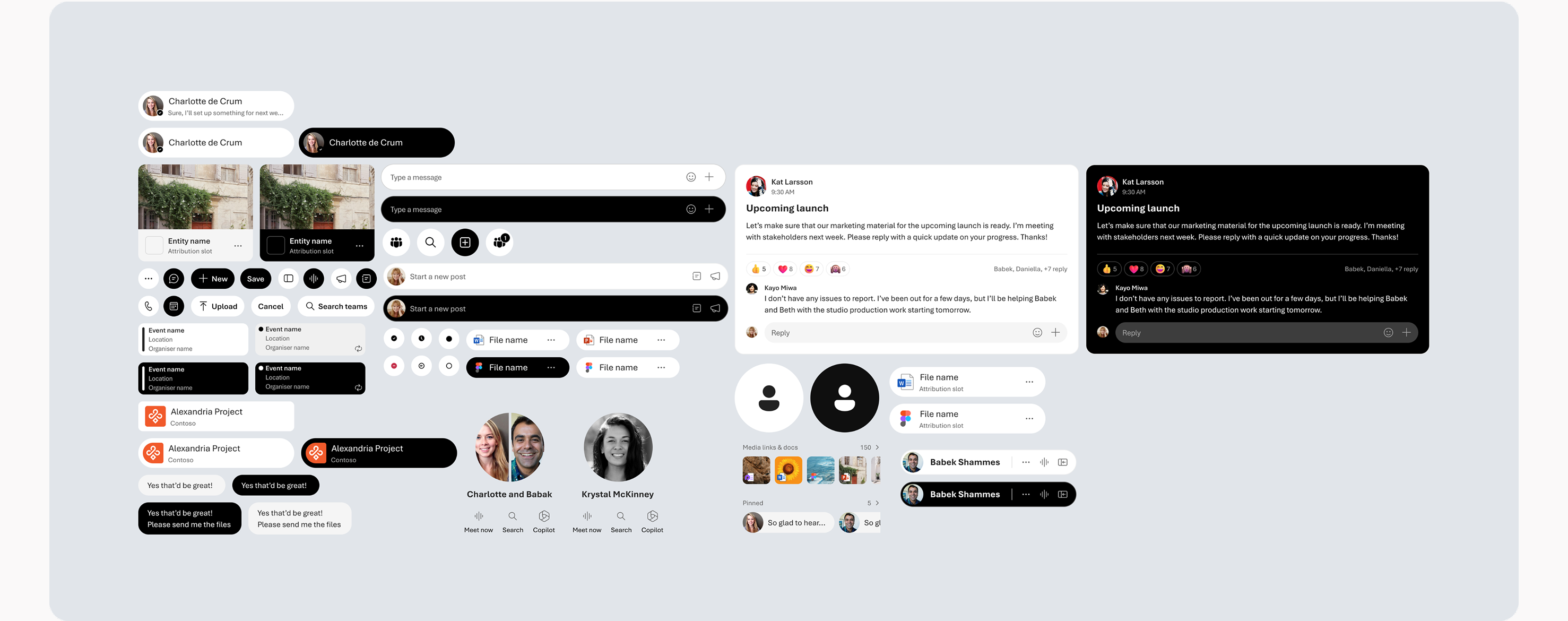
I designed this neutral theme to further reduce complexity. The idea was simple: the only colour visible on the screen would come from customers, with no shadows or unnecessary colours in the product.
After each visual change, we immediately observed that Teams was perceived as a lightweight tool. Many internal teams provided the same feedback right after the update.
Design lead: Daisy Geng
Designers: Vivian Hsu, Rebecca Guss, Suvo Ray


